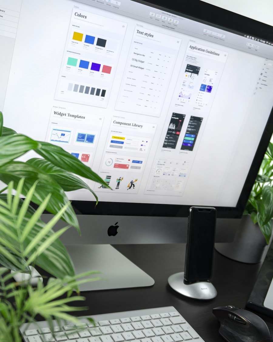
Designed for Every Screen
- Mobile-First Design
- Responsive Layouts
- Cross-Device Compatibility
- Performance Optimisation
My Specialist Deliver consistent digital experiences across every screen with responsive designs that adapt seamlessly to different devices, resolutions, and user behaviours.
User Behaviour Analysis
Screen Mapping
Layout Strategy
Wireframing
Mobile-First Design
Adaptive Layouts
Flexible Components
Interactive Elements
Cross-Browser Compatibility
Speed Optimisation
Accessibility Improvements
Performance Tuning
Device Testing
Quality Assurance
Design Refinements
Final Deployment
Responsive Journey Users switch between devices throughout the day. We design interfaces that remain intuitive, visually consistent, and fully functional across desktops, tablets, and smartphones.
We design intelligent systems that help businesses think, decide, and scale faster.
Build flexible designs that adjust effortlessly to different screen sizes and resolutions.
Enhance loading speed, usability, and accessibility to deliver smooth interactions for every user.
Client Satisfaction Rate
Verified Lead Accuracy
Get expert consultation for Responsive Design